Showing posts with label letterpress. Show all posts

Monday, December 27, 2010

go ahead say it.

This is:. once upon a time. in my imagination.
Pakorn:. pondering. check back soon.

Thursday, December 23, 2010

count down to eleven.

This is:. forget christmas 'cos it's new year. Holiday cards, letterpress using split ink fountain technique. Wooden block type forming a christmas tree and Glamour typeface with charming brackets, 4.5" x 6.7" on Fabriano single cards and envelopes. Limited edition, 50. 

Pakorn:. "Christmas is over rated" –yep, I said it. And New Year is so 'in'. The concept is to have the least amount of Christmas/Holiday color as possible so I chose this nice 'grass green' gradation with a peachy blush orange. Such a breath of fresh air. In addition, there is no Christmas or those dreadful looking forever stamps here! Just a chic "Abstract Expressionist" stamps series (circa 2009). Can't wait for a fresh new year. Oh and btw, happy hanukkah, merry christmas, merry/happy kwanzaa... whatever you celebrate I hope you have a blast!


Friday, November 26, 2010

perfectly disgusting!


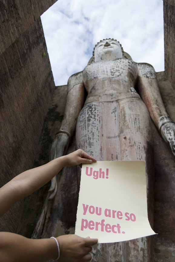
This is:. ugh! you are so perfect. Letterpress, 'Barbie' pink wooden type poster on a Cream BFK Rives, 28" x 38"with beveled edges.
Pakorn:. I guess this is a sneak preview of my trip to asia, I will load additional pictures in the following weeks and months. So stay tuned! Overall we had a blast! Traveling throughout Thailand, got a glimpse of Laos, stared at Burma, (didn't make it to) Cambodia, and struck a pose in Malaysia. On the beach, in a taxi, on a bus, drifted in a raft, I carried my precious work with me. People glared, stared, mumbled, peeked, and best of all whispered about my creamy creation. Besides--I didn't have much to say except, Ugh! you are so perfect!


::from top to bottom:: 1. Sukhothai, Thailand// Wat Mahathat. 2. Trat, Thailand// Koh Chang. 3. Kuala Lumpur, Malaysia// Petronas Tower. 4. Kanchanaburi, Thailand// Sai Yok Yai Water. 5. Sukhothai, Thailand// Wat Mahathat.

pukeingly awesome!


This is:. ugh! you are so perfect. Letterpress, 'Barbie' pink wooden type poster on a Cream BFK Rives, 28" x 38"with beveled edges.
Pakorn:.Don't you just hate it when you see something and all you just want is to 'squash' it. Maybe it's just too perfect. Well, don't get me started! I often have that feeling–now, don't send me to anger management! I'm just having one of my 'I wish I though of it moment.' Well, I turn that tantrum in to something good = this poster. I finished it and set it aside hoping to find a good use for it. And did I ever! I took it on vacation with me throughout s. east asia.


::from top to bottom:: 1. Sukhothai, Thailand// Wat Mahathat. 2. Mae hong Sorn, Thailand// Pha Sua Waterfall. 3. Mae hong Sorn, Thailand// Baan Rak Thai Chinese KuomintangVillage. 4. Sukhothai, Thailand// Wat Si Sawai. 5. Sukhothai, Thailand// Wat Mahathat.

Wednesday, September 1, 2010

mr. & mrs.


This is:. mr. and mrs. Thank you--letterpress cards using Glamour, and Bulmer Italic 5.12" x 6.7" on Fabriano paper and envelopes. With a 'sweet' heart dingbat and wonderful brackets. Using the brides theme color for the wedding, aqua blue. Delivered to them in a customized blue box.
Pakorn:. For my cousin's wedding in Arizona on July 31st, I decided to make them thank you cards. I was trying to visualize how/what to make them and I thought of this simple idea of using the Mister and Misses theme. This is super elementary but I felt that it expressed a pretty strong message regarding their commitment. This card was made with love, customized with care, and simply yummy! Congrats to the bride and groom.

This-n-that:. Diamond and Blue Spinel Ring, Edwardian Era (circa 1901-20)
Found and brought this in an antique shop about two year ago, I just couldn't resisted the old mind cut diamond and what looks like blue sapphires are actually the rare blue spinel. It was a pretty good deal too, that's when the economy was starting to tank and no one was buying, lucky I guess? It's exquisite, these pictures doesn't do it justice.


Saturday, May 22, 2010

no, you didn't!


This is:. no, you didn't! Letterpress poster on BFK Rives, 7.75" x 22" using the split ink fountain technique. Various wooden type and Century Schoolbook Bold 18 pts, with awesome brackets.
Pakorn:. It all started with the O. I found this amazing wooden letter, just calling for me. Well, I sat on it for a week. I kept seeing this image in my head of a person, finger shaken' head moving Oh, no, no, no, you didn't... kinda person. So that's how the project came about. I love this print so much, I am looking forward to printing it in variation of colors.


hey you. yes you!


This is:. hey you, yes you! Letterpress on Fabriano single card 4.5" x 6.75" using Jensen 24pts.
Pakorn:. Umm...m just like it said. I kinda forgot about this quote until now. I saw it everyday when I was working in the library post High School. There was a small signage above the kitchen sink, reminding peeps to clean up after themselves. Most people probably ignored it but for me it was so clever. So, I revised it with a few addition. Also, I this typeface-- look at the punctuation the [.] and the [!] makes me melt.
Oh, the library version was sans Jack Ass of course.


Tuesday, May 18, 2010

just because.


This is:. cute as a button. Letterpress using Graver 24pts 5.25" x 1.5" With various buttons, and colorful sewing threads.
Pakorn:. What it's for? I don't have an answer, it's one of those 'just because.' But if you must, you can use it as a bookmark!
I was inspired by Japanese uniform (fashion--of course). Where the second button from the top of a male's uniform is often given away to a female he is in love with, and is considered a way of confession. The second button is the one closest to the heart and is said to contains the emotions from all three years attendance at the school. The whole thing is enhanced by the look of a traveling sewing kit. 

So consider yourself loved when you received this.


business card galore!


This is:. i am pakorn business card. Letterpress on chipboard, with custom plate for precision, Georgia Bold, and Bodoni BE (medium and light). Measuring 1.75" x 3.5" with hand painted edges, neon pink, beyond bright orange, and lime green.
Pakorn:. Very very excited about my new business card (and letterhead, look for it in a later post). Looking forward to the website launching soon.
In the mean time I hope you enjoy the hand print, hand cut, and hand paint edges. Grab it while you can before I change my mine and redo the logo once again.


Tuesday, May 11, 2010

in the a.m.


This is:. in the a.m. Letterpress on Fabriano single card 4.5" x 6.75" using Graver 24pts.
Pakorn:. I saw a quote that said, 'Nothing good happens after 2:00 a.m.' And I thought to myself that it's so true. Then I made up another quote that said 'Everything wicked happens at 5:00 a.m.' which again to me was right on the dot. But I mean wicked in a good way. 
For those crazy peeps that are up during that hour, I find that it's the best time for your creative flow. It's when you been up all night fighting sleep (or rather not to sleep) and then it hit you bang-- 5:00 a.m. an amazing idea, that's when you take it and run.
Other wickedly great thing about 5:00 a.m. are peace, quiet, um... sex, sunset, and I'm sure you could come up with many more wicked things to add to this list.


Sunday, May 9, 2010

b-day young.


this is:. b-day young. Letterpress doily birthday card using Jensen and Tiffany Shade then hand sewn on to a 5.5" x 8.5" chipboard in an A9 5.75" x 8.75" leaf color envelopes.
Pakorn:. One of my favorite project and also one of my first project in letterpress. Wanting to push the envelope and experiment with something that could not come out of my printer. I shopped, and shopped for material that I could print on and came up with these amazing doily. With much work and help from Denise Figueredo of Figgy Press this project came out 'B'eautiful. Not to mention the amazing quote that I stumbled upon.


Friday, April 30, 2010

ur top shelf material to me.


this is:. top shelf. Letterpress on brown paper bag using Folio 24 pts further enhance by a liquor bottle dingbat.
Pakorn:. Enough said, 'You're top shelf material to me.' Such a high complement in my mind. This project came about during my material exploration craze. Wanting to print on anything but regular paper, this project also came about at the begin of my letterpress day. This bag can be used in so many ways, but I like it best as a gift bag. And who wouldn't melt when they receive the compliment.

Thursday, April 29, 2010

u suck on this.

this is:. u suck on this. Letterpress, special occasion card with various wood types and Universe 14pts. Printed an A6 4.62" x 6.25" folded cards superfine soft white in 4.75" x 6.25" with fuchsia, papaya, and moss color envelopes.
Pakorn:. Can you imagine receiving this in the mail. Well, i can... and I love it! You suck, and I mean it in the best possible way. Why, does this term have to be so negative? I am sure you have one of those friends, love one, or even nemesis that you would just love to hate. Especially, those that have such great ideas that you wish you thought of it first-- you know those kind of people. So the next time someone said this to you, just take it as a compliment.

Oh, and I also included a card for those that just plain sucks. And we know we have a few of those people too.


welcome.

A card just for you. I welcome you to thisispakorn.blogspot.com, this blog is an extension of my graphic design work and is founded on a desire to explore new territory. 'This' being letterpress, photography, printmaking, fashion, interior, design, and much more. With one common denominator in mind, Me (Pakorn).